TEA AMOHealing teas by
healing hands
Born from an obsession to find a natural solution to cope with the stresses of studying, working and juggling a young family, Chantal Danieli created Tea Amo — a range of organic healing tea blends.
SCOPE— Marque
— Identity
— Menu
— Packaging
— Publications
— Website
RECOGNITIONGraphis Design Annual (US)
— Gold Award
Entrepreneur Magazine
— Packaging of the Month
The Dieline
— Featured
Challenge
—
We were asked to create product identity that would reflect Chantal’s expert approach to blending herbal teas whilst also standing out in a saturated market.
Drawing on the owner’s extensive knowledge of herbs and natural medicine we created a unique brand identity that balanced contemporary blends with traditional ingredients. Our product identity was to position Tea Amo as an appealing alternative to other traditional medicinal treatments.

Direction
—
Using 'healing hands' as a theme across the brand to reinforce the idea of care and quality.
We develop a series of ‘healing hand’ icons to differentiate each blend and as communication devices for call-out information and ingredient details.

Science led
—
A unique visual style that straddled traditional medicine and contemporary tea blends was created.
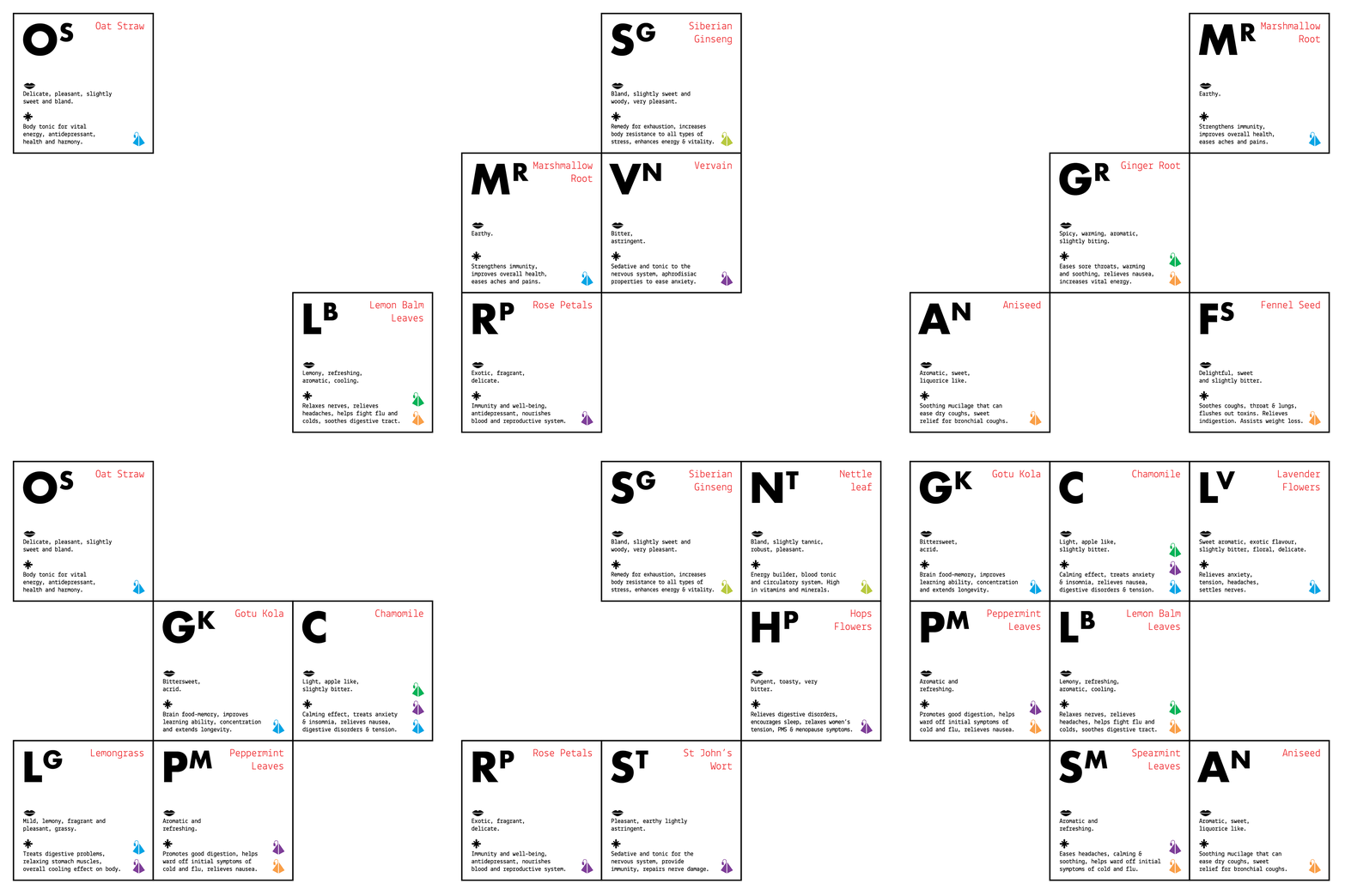
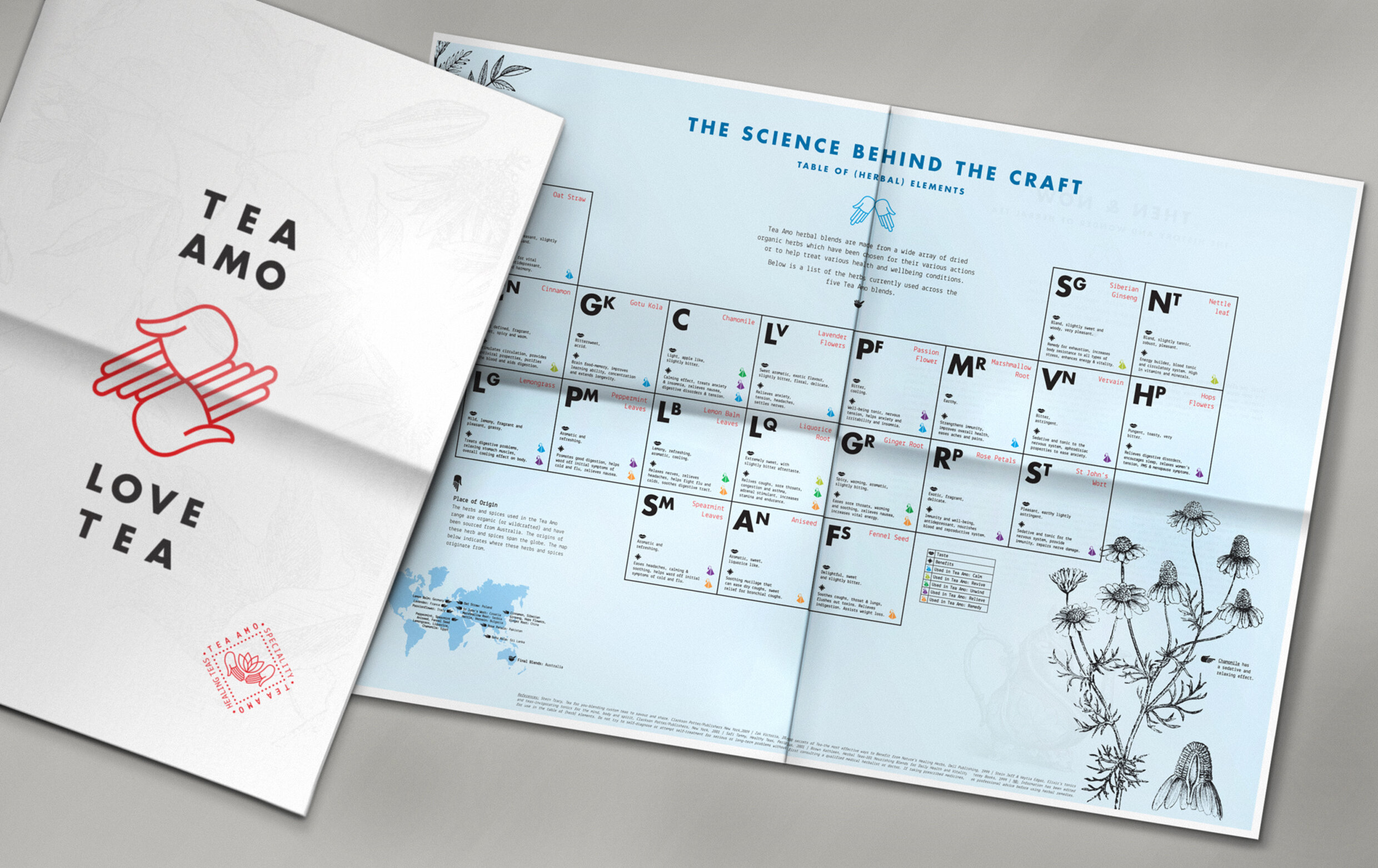
A ‘table of (herbal) elements’ breaks down each blend — created from the highest quality organic ingredients, sourced from around the world.
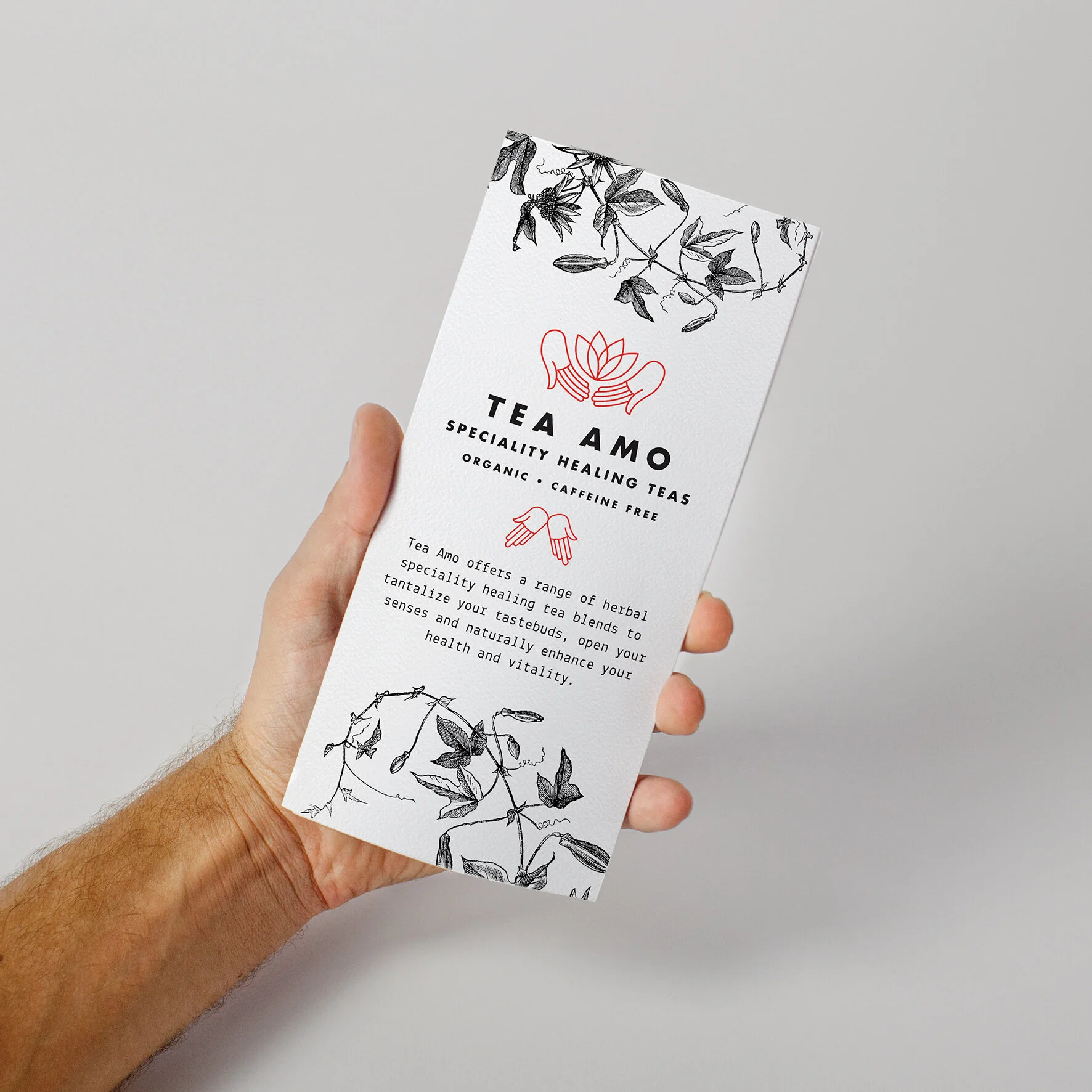
The product identity was brought to life across print collateral, online, packaging and a tabloid publication to showcase the science behind the craft.
The brand packaging work has been featured in several publications including the Leadership issue of Entrepreneur.


The work resulted in a brand, packaging range and supporting material that established Tea Amo as a serious contender in the tea market. Stocked only in premium resellers across Sydney the range of tea has been met with a hugely positive reaction and is available in the USA, UK and Paris.
FBD TEAMCreative Direction
— Chris Thomas
Messaging & Copy
— Louise Broad


